- November 29, 2008 5:30 AM
-
BlogCFC,
User Interface Design
I've talked about it before, but I find classic multi-selects in HTML to be really hard to use. You invariably have to end up putting some explanation text to let a user know how to select more then one, and its easy to clear your selections everything while trying to select an additional item. I put these ideas into practice in BlogCFC to help with category selection. I replaced the following code in admin/entry.cfm starting at line 391:
<cfif allCats.recordCount>
<select name="categories" multiple size=4 class="txtDropdown">
<cfloop query="allCats">
<option value="#categoryID#" <cfif isDefined("form.categories") and listFind(form.categories,categoryID)>selected</cfif>>#categoryName#</option>
</cfloop>
</select><br>
</cfif>
With this code:
<cfif allCats.recordCount>
<ul class="multiselect">
<cfloop query="allCats">
<li><input id="cat_#categoryID#" type="checkbox" name="categories" value="#categoryID#"<cfif isDefined("form.categories") and listFind(form.categories,categoryID)> checked="checked"</cfif>/><label for="cat_#categoryID#">#categoryName#</label></li>
</cfloop>
</ul>
</cfif>
I also added the following code the admin style sheet ( /includes/admin.css ):
ul.multiselect {
height: 100px;
width: 225px;
border: 1px solid silver;
list-style-type: none;
padding-left: 3px;
overflow: auto;
}
ul.multiselect li label {
display: inline;
padding-left: 2px;
}
That makes it a lot easier to keep track of categories without messing something up.
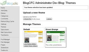
 One of the really nice things about Wordpress is that it has a very easy to use admin for managing your blog's theme. Working with the design in BlogCFC is a pain: the design is integrated into the actual code for the blog. Further, the code for designs is strewn through a number of different folders (includes/, images/, tags/, includes/pods/, etc.), which makes it hard to fully update a design. I've made the necessary changes to make BlogCFC handle custom theming as easily as Wordpress: click more to see the details.